Wednesday, December 2, 2009

More Salt Lake City Musings: Smithson's Spiral Jetty and Concerns for Conservation


Robert Smithson, Spiral Jetty, 1970.

After the rather drab photographic work (reviewed in previous entry) I viewed at the Salt Lake Art Center, my Thanksgiving holiday to Utah was proving to be fairly art-less until a last minute decision to drive out and see the Spiral Jetty constructed within the Great Salt Lake. What I have always found interesting in land art or site-specific work is the possibility for the work to change or disappear given the environment within which it is placed. Part of the unique character of site specific art is its permeability and tangibility not found in artworks displayed carefully within the white walls of a museum or gallery. So, I found it humorously coincidental that, while reading the New York Times online this morning, I ran across an article titled, "How to Conserve Art that Lives in a Lake?" Concerned with the Jetty's previous dissolution into the lake and its reemergence over the past few years, the article discusses The Dia Foundation's constant documentation and photography of the Jetty to chart its changes in order to make decisions concerning its eventual conservation. With growing industrial projects planned to be carried out near the sculpture, as well as natural interventions such as silt build up and varying water levels, the Spiral Jetty is in constant transformation, lending an air of fluidity that leads many art enthusiasts to worry over its possible temporary existence.
The Dia Foundation, which is also in charge of conservation over Walter De Maria's Lightening Field, a site-specific sculpture of metal rods implanted in the earth of rural New Mexico, is responsible for the precarious and difficult decision of whether or not to intervene in the natural life of site-specific works in order to preserve them for future generations. In my opinion, to conserve or restore these works is to damage the original intent of the artists who created them, Smithson noted for stating, "I am for an art that takes into account the direct effect of the elements as they exist from day to day. " It is necessary to allow these works a process of erosion, decay, or survival on their own terms as they relate to their environments, instead of interrupting their processes with the desire to preserve the work. For as much as I enjoyed walking out onto the lake and seeing Smithson’s work, the most beautiful part about it was that, in that moment, the Spiral Jetty existed for me alone. Whatever condition the sculpture was in when I viewed it will change over time and the next visitor to the Great Salt Lake will experience a different artwork. The transitory nature of the site-specific work is what provides it with importance. To “fix” or restore the Jetty, or any other environmental work, is to compromise the function of the work itself. As Richard Serra’s Tilted Arc, once removed from its original, intended location at the Federal Plaza in New York City, could no longer be an artwork as its fundamental environment is was created for was removed, so does alteration of the Spiral Jetty, or its environment, compromise Smithson’s intent and the integrity of the artwork.

Richard De Maria, Lightning Field, 1977.

Richard Serra, Tilted Arc, 1981.


Saturday, November 28, 2009

Exhibition Review IV: Thanksgiving Trip to Salt Lake City, Utah: Tillman Crane's Jordan River Photographs at the Salt Lake Art Center


Tillman Crane, Swimming Hole, 2006.

With little knowledge of Salt Lake City, much less its contemporary art scene, other than Joseph Smith’s spiritual revelations, polygamy, and ornate Mormon temples, I was intrigued to make the eleven-hour drive to my best friend’s Utah home for the Thanksgiving holiday. Admittedly skeptical about critical, radical art produced in the city where most of its inhabitants don conservative, white undergarments under their clothing as a symbolic reminder of the sacred covenants of Mormonism and as a literal source of protection from the world’s evils, I ventured to the Salt Lake Art Center to view their current exhibitions, located just a block from the central Mormon temple from which all streets in Salt Lake radiate outward. Its mission statement claiming to “encourage contemporary visual artists and art which challenge and educate public perceptions of civil, social and aesthetic issues affecting society,” I suspected that should analytical and engaging artwork be found in Salt Lake, it would likely be at the Art Center.

Entering the photography exhibit of contemporary writer and artist, Tillman Crane, I was surrounded by a plethora of images concerning one of Utah’s most vital waterways, the Jordan River. Former mayor of Salt Lake City and now current Director of the Utah Rivers Council, Ted Wilson, coincidentally happens to be my best friend’s stepfather, and educated me on the river’s redemptive history throughout our walk through of the exhibit. Originally marking the boundary between civilization and the rugged unknown of the west, the Jordan River quickly became polluted and unusable in the age of industrial revolution and Mormon settlement in the early 1900s. It was not until the 1970s that a series of laws enacted under the Environmental Protection Agency led to gradual cleanup and protection of the Jordan. Crane’s photographs document the Jordan River from its source at Utah Lake to its mouth at the Great Salt Lake. In most of the photographs, Crane depicts the river in its natural state, while in others there is evidence of human interruption, engineering, and re-routing. Crane works with large format cameras to produce palladium prints that appear metallic and slightly washed out, lending an air of mysticism to the photographs.

In the photograph, Swimming Hole, Redwood Road (2006), Tillman’s camera captures a warped, twisting tree overlooking a spot of the river frequented for summer swimming sessions. Heavy contrast evades the image, the river’s water and fallen branches pervading its ripples falling almost transparent behind the dark tree in the foreground. The photograph appears calm and still with little movement depicted in the river or the tree’s leaves, providing the viewer with a serene scene of a local haunt. Tillman presents the Jordan River in a nostalgic, inspiring way akin to most previous and contemporary art photography. Swimming Hole immediately reminded me of monumental photographs by early photographers such as Edward Weston and Ansel Adams concerned with providing the spectator a grandiose view of America’s magnificent geography. As Abigail Solomon-Godeau notes in her essay, Photography After Art Photography, photographic works by artists such as Weston and Adams present “an auratic image” not invested in art’s role in institutional or representational critique, but rather, in framing “an intrinsic, aesthetic field.” Swimming Hole, while pleasant to look at, in my opinion is not an interesting or unique image. The photograph is beautiful and the use of palladium to provide the river a glowing, silver tint is aesthetically pleasing, but does not challenge the viewer in terms of “public perceptions of civil, social and aesthetic issues affecting society,” as the Salt Lake Art Center claims its exhibitions to do. The photograph quickly fades from memory as the visually striking image provides nothing critical to think about, and thus, nothing worth remembering after the exhibition.

Ansel Adams, Siesta Lake, 1958.

Edward Weston, Juniper, Tenaya Lake, 1937.

Tillman’s photograph titled Trestle Bridge (2008), while shot in similar style and produced with the same metallic sheen as Swimming Hole, is aesthetically more interesting in terms of diagonal lines captured in the scene. The photograph presents a steel, rather industrial-looking bridge stretching above the Jordan River, whose diagonal line parallels that a concrete embankment nearby, graffiti scribbled across its surface. In the background, trees and brush huddled around the water’s edge mingle with the distant Wasatch mountains and Utah skyline, creating a dichotomy between man-made materials and those of nature. Viewed in light of a possible commentary or analysis of the artificial and imposed on the native, Trestle Bridge slightly ventures into the realm of, what Solomon-Godeau describes as, photography after art photography, or photography used in postmodernist art to critique or draw attention to a system of representation. However, the work ultimately fails at escaping categorization as an auratic image, for any critical analysis gleamed from the work is ultimately the viewer’s own, the photograph produced to monumentalize the Jordan River and its beautiful attributes, rather than to make analytical commentary.

Tillman Crane, Trestle Bridge, 2008.

The distinction between avant-garde photography and art photography, states Solomon-Godeau, “lies in the former’s potential for institutional and/or representational critique, analysis, or address, and the latter’s deep-seated inability to acknowledge any need to even think about such matters.” It is clear that Tillman’s photographs of the Jordan River are concerned with the harmony and elegance of the image over stimulating analysis. While visiting the Salt Lake Art Center provided a leisurely break from the often stressful atmosphere of the winter holidays, Tillman’s works, sadly, failed to impress upon me Salt Lake City as a place producing interesting and radical art, and instead, as producing conservative, “pretty” work suitable for the Mormon viewer’s eyes.

Wednesday, November 18, 2009

The Los Angeles Municipal Art Gallery: National Print Exhibition


Wandering through Barnsdale Park in Los Feliz this past weekend, I stumbled upon an enormous printmaking exhibition at the Los Angeles Municipal Art Gallery. Celebrating the 20th anniversary of the Los Angeles Printmaking Society and featuring work from local Otis College students, the show displayed over 150 contemporary prints of multiple processes, including serigraphy, lithography, and intaglio. Of notable interest in the artworks presented were prints by two artists, JenClare B. Gawaran and Poli Marichal. Although different stylistically, I felt that these two artists' works communicated with one another through addressing similar themes of identity and character.

Gawaran’s print, titled “Manika,” presents the torso of a female body, holding up a paper-chain link of different women (fig. 1). Upon closer inspection, one realizes that the women actually represent the same person dressed in different clothing, such as the scrubs of a doctor, or a traditional Filipina dress. Whether or not the woman depicted in the paper-chain link is herself, it is clear that Gawaran is exploring issues of identity through the multiple representations of the same figure in different suits. Gawaran’s artist statement presented on her website emphasizes her interest in cross or multiple identities, as she remarks, “As an Asian-American, my current work splits the phrase and myself into two separate identities. My goal is to discover aspects of my background that I previously took for granted, as well as to see how I conform (or not) to traditional Filipino customs and expectations.” Manika may be an insight into Gawaran’s anxieties concerning what role she must play in society as both Filipina and American.


Marichal’s print, titled “Vigilia,” similarly represents a certain cultural identity as does the work of Gawaran, but concerns Latin Americans. Standing atop a tall rock, a lone wolf stands quietly, seemingly content with his position as a slight grin crawls across his face. In contrast, cowering beneath the rock is a family attempting to sleep, a child huddled listlessly near its mother’s chest. A water jug in front of the male figure suggests the family has been traveling or hiding for a long period of time, and have now finally closed their eyes out of exhaustion. The difference between the calm, content wolf and the weary, tired family below are indicative, perhaps, of the Latin American immigrant experience as one that is draining and dangerous, a “wolf” constantly on one’s heels. As a Puerto Rican artist, Marichal is likely calling attention to the identity of the nomadic immigrant, never quite at home or at peace in a strange country. This lost, or fragmented identity is portrayed through the exhausted faces of the sleeping family. The prints of both Gawaran and Marichal consider cultural identities and the anxieties or difficulties associated with being the “other.”


Wednesday, November 11, 2009

Exhibition Review III: Monster Drawing Rally 2009, The Outpost for Contemporary Art


This past Sunday, community members of North East Los Angeles ventured to the Eagle Rock Center for the Arts to witness artists producing their crafts. An exhibition whose proceeds supported the Outpost for Contemporary Art, a non-profit devoted to cross-cultural exchange and local artist collaborations by developing artistic projects that stimulate social interaction and emphasize process, the Monster Drawing Rally featured a live drawing event consisting of four, one-hour shifts with 25 contemporary Los Angeles artists creating work simultaneously each hour. As the artworks were completed, they were displayed on the gallery walls for viewing and purchase. Far from a traditional gallery show, the spectators watched 100 artists draw, paint, collage, and silkscreen in rapid succession in a sort of controlled artistic chaos that was invigorating and fascinating to view.

Walking in between clusters of slightly intoxicated guests to the circle of tables where the artists produced their works under the curious eyes of spectators, I was quickly drawn to the paintings of a young artist, Jessica Minckley. A recent Otis College graduate whose work has been shown at LA Louver in Venice as well as Carl Berg Gallery where she held her first solo exhibition, I watched as Minckley dipped her brush in vibrant watercolors to paint text and drawings over torn pages from an antique book. Describing her work as recontextualized found objects that are “sentimentally charged” with spiritual or psychological suggestions, her works appear deeply personal and intimate, as if the viewer is allowed to peek into Minckley’s thoughts and ponderings on old words written on a yellowed page. An example of such work is a piece titled “Without Representation,” in which Minckley draws swirling, delicate lines that come to create a circle on an old book page displaying the words of an Arab proverb: “Happy who has seen the most water in life.” The blue lines appear as a musing on the proverb, their flowing quality seeming to move like water, and their circular shape indicating some type of constant, ongoing eternity. The work appears peaceful and somewhat mysterious, as it is up to the viewer to ultimately make sense of the combination of Minckley’s drawing mixed with the previous words on the page. A seemingly hermetic process that depends on her own inner perceptions, interests, and vocabulary inspired or conjured by the text on the book page, Minckley’s work displays quietude and introspection.

Jessica Minckley, Without Representation.

Leaving Minckley’s table in a surreal, pensive state, I floated towards the table featuring artist Brian Bress, whom I found hunched over a stack of magazines, feverishly cutting away. An artist that works in many mediums including photography and video (which he described as “mindless dabblings”), Bress’s comment and collages reminded me of surrealist works by Max Ernst in which he would unconsciously mix and match images of old etchings and mass culture advertisements to create bizarre works that leave the viewer to wander through their absurd complexities without ever really finding a clear meaning through the cuts and clippings. In Bress’s collage, “D.B.,” a portrait of a woman is covered in long, cut up images of flowers, vines, and tree branches to create a biological veil that covers her face. Bress also places more vine-like, crawling collage pieces at the bottom of the work, which stand stiffly as menacing knifes. Rather than a candid image of a beautiful woman, Bress’s interference complicates and disrupts the original photograph, displacing its original signification with added, disjointed collage pieces. While the original intent of the image of the woman is still intact, it is complicated through Bress’s manipulation. As the viewer attempts to negotiate between the woman and the tangle of vines and bark in front of her, the images, while distinct, must be read through each other, thus confusing the relationship of either image to its signifier. Bress’s collages strike me as similar to a surrealist or post-modern exploration into found images and their intentions, and the frustration or anxiety of the viewer when s/he cannot read the collage in any given way.

Max Ernst, Untitled.

Brian Bress, D.B.

Lastly, I would like to describe the work of an artist I stumbled upon before exiting the Monster Drawing Rally. Stuck in the corner table next to a plethora of large sound equipment, Sarajo Frieden sat with her drawing pencils spayed out on the table, creating tiny geometric shapes which she then connect together with embroidery thread. In Frieden’s work is the element of the handicraft, as she frequently implements sewing and needlework into her canvases. As she noted in her artist statement displayed at the Monster Drawing Rally, the location of her Los Angles studio, situated between Little Armenia and Koreatown, acts as “a host of disparate vocabularies from the worlds of fine, folk, and decorative art,” the influence of which can be seen in her folktale, narrative works. In her work, “Landscape 1,” Frieden depicts a fairytale vista in which multi-colored cloud forms emit rays of intricate, embroidered patterns. Geometric mountains and hills sprout from the ground while other indeterminate, yet seemingly fitting abstracted shapes float calmly throughout the piece. The cacophony of color, shape, and line draw attention to the simple landscape as one that is not realistic, but created through the hand of an artist who experiences different languages, cultures, and histories on a daily basis. Watching Frieden work was almost as mystifying as one of her drawings, as she held most all of her pencils in one hand, and appeared to scribble rapidly, as a child would, onto paper to make her artwork. Her dreamlike creation, along with the works of Minckley and Bress, cemented my afternoon as a transportation into the minds of other human beings, and their consequent views of the surrounding world.

Sarajo Frieden, Landscape I.

Saturday, October 24, 2009

Survival Research Laboratory: Man and Machine


An interesting video highlighting the performance art of Marc Pauline and the Los Angeles artist collective, Survival Research Laboratory(SRL). Founded during the late 1970's, SRL aims to show interactions between machine and machine, or man and machine. During a heightened time of technological overload post Vietnam and the Cold War, SRL is interested in the often visceral, bloody scenes of war, death, and destruction that is transmitted to the general public through technological mediums, ie television and radio. Frustrated that these mediums flatten and neutralize the horrors of modern times, SRL has put on several performances that highlight and expand upon that horror. The video above (1980)shows SRL's man-made machines attacking and exploding each other and themselves, effective as suicide/homicide apparatuses. Later works have similarly explored the relationship between man and machine, using robots to systematically work together to tear apart the bodies of dead animals in front of a willing audience.

Wednesday, October 21, 2009

Exhibition Review II: Pasadena Museum of California Art’s Wayne Thiebaud: 70 Years of Painting, October 4, 2009 – January 31, 2010


Wayne Thiebaud, Cake Window, 1976.

The Pasadena Museum of California Art (PMCA) is currently home to over one hundred and twenty drawings, etchings, prints, and paintings from the talented hand of Wayne Thiebaud, the now 88-year-old artist. Arriving at the October 9th PMCA benefit dinner and members opening in a lavender colored button down and a heavy pair of glasses weighing on his nose, Thiebaud, when asked to describe the intentions of his art, unabashedly stated with a slight smile, “It doesn’t really mean anything.”

Thiebaud’s humorous response appropriately defines his rather multidimensional style of painting, alongside other Northern California Funk artists such as William T. Wiley, Roy de Forest, and Manuel Neri (many of whom taught with Thiebaud at UC Davis’ fine arts department), which frequently links high art with pop culture in a sarcastic, bold, and interesting way that starkly contrasts the Abstract Expressionism work emerging contemporaneously from the New York school. Known best for his paintings of candy apples, cakes, and other confections, PMCA’s Thiebaud exhibition also highlights the artist’s less familiar paintings of brightly colored, semi-abstract California landscapes and unique renderings of the traditional subject of the human figure.

Upon entering PMCA’s main gallery, an explosion of vivid colors splashed on canvas hits the eye of the viewer. The obvious initial works to view, as noted by the hoards of museum members who crowd the gallery wall, mouths slightly salivating, are Thiebaud’s dessert paintings. In Cake Window (1976), Thiebaud paints a variety of cakes placed delicately on high stands, their shadows looming below on the stark, white display case. The cakes are rendered in rich pastels, allowing the frosting and decorations to glisten and seemingly drip from their realistic shapes into the viewer’s mouth. However, while clearly images of sugary treats, Thiebaud makes no attempts to hide his graceful, painterly brush strokes, as his hand is easily identified in the layers of while paint surrounding the cakes.

The image of the consumer object such as Thiebaud’s cakes, or paintings of French fries, ice cream, and gumball machines, recall Andy Warhol’s similar exploration of commodity as subject, such as his Campbell’s Soup Can.

Andy Warhol, Campbell's Soup Can, 1968.

However, although both artists have focused on the familiar and recognizable, Warhol’s soup can is much more faithful to the original than Thiebaud’s. His food item illustrated for the viewer in near perfection (at times implementing silkscreening to get a mass-produced, commercial effect), Wharhol’s can lacks what Thiebaud’s painting showcases through his cakes with respect to daring line, color, and gesture. While Warhol is usually cited as similar in style to Thiebaud’s food paintings, Thiebaud’s bold colors and thick paint seem more akin to the work of Claes Oldenburg in terms of expression and humor, such as his Floor Burger.

Claes Oldenburg, Floor Burger, 1962.

Similar bold colors, exaggerated strokes, and deeper abstraction describe Theibaud’s landscapes on view at PMCA. In his painting, San Francisco West Side Ridge (2002), Thiebaud paints the frequently depicted rolling hills of San Francisco in a way that confuses the viewer’s perception of the work. The flowing hills are painted instead in terms of straight lines, as if one was viewing a sloping street from directly in front, appearing parallel to the horizon line. Similarly, Thiebaud renders the descending hill in the foreground in a diagonal fashion. The colors of the landscape are no less realistic, painted in hues of neon green and orange. The long shadows cast by the tall, Victorian houses hit the pavement below in various shades of blue. As in his Cake Window, the visuals are discerned, as one can see that Theirbaud intended to paint a landscape. Far from being a traditional Calofornia landscape painter like his forefathers Millard Sheets and Maynard Dixon, Thiebaud’s unique angles and color choices place San Francisco West Side Ridge on par with abstract expressionism, but in a more controlled, quintessentially California way.

Wayne Thiebaud, San Francisco West Side Ridge, 2002.

Of unusual significance for the viewer of Thiebaud’s work are his canvases laden with most traditional, and thus, frequently dull subject, the human figure. Thiebaud’s painting bodies, however, fail to disappoint and are instead treated to the same pastels, layers of paint, and broad strokes as his dessert images. In Three Prone Figures (1961), Thiebaud depicts three beach-goers lying on their backs, faces down in the sand. Their pale bodies float side by side in the middle of the canvas, surrounded by a sea of white paint. Far from a fun day at the beach, the isolation of the three figures from each other as well as to their surroundings suggest a longing and distance between the bodies, as a supposedly happy memory appears tinged with a disturbing loneliness. It is worth noting that, while viewing Three Prone Figures, I heard a couple remark that the stiff corpses were more appropriate for body bags than a day in the sun. As Thiebaud remarked in the Palm Springs Museum Art Museum, “The isolated figure series… are not supposed to reveal anything. It’s like seeing a stranger in the some place like an airline terminal for the first time. You look at him, but you don’t have any particular feeling about him.” Thiebaud’s treatment of the figure, much like his desserts and landscapes, are familiar images displaced into the realm of the slightly fantastical and strange, providing the viewer with a different and far more interesting perspective with which to observe quite ordinary subjects.

Wayne Thiebaud, Three Prone Figures, 1961.

Monday, October 12, 2009

Rebecca Campbell: Nostalgic Dreaming


Rebecca Campbell, Daddy Daughter Date, 2009.

During our class discussion of contemporary painters last week, I was reminded of a Los Angeles-based Artist, Rebecca Campbell, whose work I saw last February at LA Louver Gallery in Venice. The show that I saw was entitled Poltergeist, and featured Campbell's works that focused on childhood memories and nostalgia of growing up in Salt Lake City, Utah. Among an installation of a giant, velvet covered avocado tree with blue birds perched atop its branches, and gold-plated bees strung from the ceiling (seen below), Poltergeist featured a collection of haunting paintings both life-like and seemingly dreamy, which transported the viewer back into Campbell's dusty, religious, and hazy childhood. The opening image of this entry, Daddy Daughter Date, features a young Campbell staring at her father seated in a recliner, his body illuminated from the glow of the television. One gathers a sense of loss or nostalgic longing from the painting, a combination of the melancholy color palate and cold, impartial distance between father and child. Similar paintings in the show feature bleak images of street lamps and telephone lines, rendering the city a quiet, almost deadly place.
Campbell's work returns painting to the figural and realistic, but is not quite the same rendering of the female nude as neo-expressionists attempted to harken back to in their attempts to recapture traditional painting styles. While Campbell is clearly trained in formal, painterly elements of accurate shadowing, depth perception, etc., she does not allow these qualities to hinder her voice in the painting, and creates works that clearly speak of her conflicted memories associated with Salt Lake City.


Rebecca Campbell, Do You Want to Hurt Me? 2009.

Rebecca Campbell, Satellite, 2008.

Rebecca Campbell, Rainbow After Dark, 2009.

Rebecca Campbell, Gretel, 2009.

Rebecca Campbell, Snow Queen, 2008.


Tuesday, September 29, 2009

Exhibition Review I: Los Angeles County Museum of Art’s Your Bright Future: 12 Contemporary Artists from Korea June 28 - September 20, 2009

Your Bright Future presents the first major museum exhibition in the United States in about two decades to focus on contemporary art from South Korea. Organized by LACMA and the Museum of Fine Arts, Houston, the exhibition features a generation of artists who have emerged from South Korea during the 1980’s, all of whose works address contemporary art trends within a uniquely Korean context. As co-curator Lynn Zelevansky notes in her essay, “Contemporary Art from Korea: The Presence of Absence,” “Coming of age amid political turmoil and increased freedoms, they [Korean artists] are keenly aware of their positions as citizens of a relatively small, increasingly prosperous but divided country in a rapidly globalizing world.”[1]

Viewing the show now several times since it’s closing, Your Bright Future has continually amazed and overwhelmed me with the enormous variety of mediums presented (drawing, installation, sculpture, video and performance art), as well as the multitude of themes addressed throughout the twelve artists’ conceptual works. Ranging from Choi Jeong-Hwa’s pop art installations to Haegue Yang’s installation and performance piece in which she expresses her frustrations with the Art Institution, Your Bright Future successfully attempts to showcase the history of nearly twenty years of contemporary Korean art in one exhibition. While the show includes a large number of works worthy of attention, the focus of this review centers on three artists whose works I feel are representative of larger concepts explored in Your Bright Future. Choi Jeong Hwa, Do Ho Suh, and Kimsooja works address what Zelevansky describes as the focus of the exhibition: “The ephemeral nature of life, time, identity, as well as on the limitations of communication across languages, cultures, and generations …”[2]

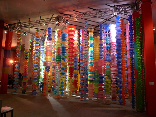
Before one even reaches the exhibition, a plethora of brightly colored plastic bowls, cups, plates, and other gadgets strung up to form a massive cube disrupt the usually quiet walk over to the Broad Contemporary Art Museum housing Your Bright Future. Initially unaware that this neon installation was the work of the Korean artist, Choi Jeong-Hwa, I took a brief departure from my intended destination to walk between the plastic garlands. Known for his appropriation of ready-made objects into monumental sculptures and installations, Choi is the only artist presented in Your Bright Future who has not had formal training or lived outside of his home country. Proudly stating at the show’s opening that he is “made in Korea,” I could not help interpret this comment as a slight pun on his unusual choice of artists’ materials that are so often “made in China.” For this installation entitled Happy Happy, Choi went to a local Los Angeles 99 cents store and bought out what appears to be the entire stock of bright, plastic kitchen utensils, toys, etc. in order to drill holes, string, and hang them together in parallel lines on LACMA’s outdoor plaza. In the second revision of this work, Choi invited the people of Los Angeles to bring their own plastic objects and hang them on a large fence near the plaza that LACMA erected for this purpose. In both cases, the viewer is welcome to touch and walk in between the rows of objects, which accounts for the large amount of screaming children attempting to swing from the installation as if on monkey bars.

Choi’s use of cheap and common objects to create Happy Happy is reminiscent of Andy Warhol’s appropriation of brand names and commodity culture in his paintings and silkscreens. Noted in Your Bright Future’s catalog, Choi is known as the father of pop art in Korea, much as Warhol is heralded as the same in the United States. The availability and commodity status of the plastic objects Choi assembles deliberately interferes with notion of the traditional artist as genius who executes his work through the careful mastery of a set skill. Choi’s work is something that anyone, including the people of Los Angeles, can produce, thus calling into question the contemporary definition of the artist and art. Further confusing one’s idea of the artist genius is how accessible Choi’s work is to the viewer. Instead of looming behind a velvet rope with museum guards standing closely by, the viewer may interact with the artwork, and even change it in some ways (Happy Happy exhibited some wear throughout the course of the exhibition due to the visitor’s touch).

Furthermore, Choi’s artworks at LACMA, as his previous works at other locations, will eventually be deconstructed and recycled. The careful preservation of the monumental creation of the artist does not apply to Choi, rather his works are impermanent and eventually preserved only through memory and photographs. As Starkman and Zelevansky write, “Choi is concerned with the ephemeral and variable nature of material life and consumer culture, as is reflected in the unstable nature of the materials he employs, like plastic.”[3] Happy Happy is a work that is transient in nature, existing only for a brief amount of time. Other artists featured in Your Bright Future similarly employ ready-made, commodity items into their conceptual works, such Gimhongsok’s use of animal mascot costumes, as well as question the ephemeral nature of art objects, such as Haegue Yang’s Storage Piece.

Entering the exhibition, one cannot ignore the presence of two large works by Do Ho Suh, each of which uniquely interpret the artist’s sense of identity through discourse between Eastern and Western architecture although sharing the same subject matter. Fallen Star 1/5 presents the viewer with a replica of Suh’s first home in the United States while attending the Rhode Island School of Design in 1981. Suh recreates the brownstone faithfully in miniature, as the viewer becomes voyeur and is allowed to peer into every apartment and marvel at the details of each place of residence: a turkey cooks in one oven, and a bicycle sits precariously in an empty hallway of another. One would assume that the apartment which displays a drafting table, paintbrushes, and a half-eaten slice of pizza was inhabited by Suh. However, far from being an homage to the building at the center of his new American life, Suh complicates the artwork by crashing a replica of his parent’s’ traditional Korean house in Seoul into the side of the brownstone. Shards of glass and fallen bricks surround the Korean home, which sticks out at an angle from the wall of his Long Island residence. Peering inside the Korean home offers a different lifestyle than the apartments of the brownstone cluttered with furniture, decoration, and objects. The Korean home is nearly bear inside; few objects are distinguishable, aside from the old sewing machine and bedroll in plain view through a window. Attached to the ends of the Korean home is a sheer fabric sewn to replicate the home and act as a parachute, guiding the East to collide with the West in a somewhat violent fashion.

Home Within a Home similarly features Suh’s Long Island and Seoul homes, however in a different material and configuration that drastically changes the reception and interpretation of the piece. Constructed with a light blue, transparent resin, the Long Island home encases his Korean house, which floats carefully between the foundation and roof of the brownstone. Unlike Fallen Star 1/5, both homes are empty and stand together as a ghost-like giant, two buildings tangled into one.

While Fallen Star 1/5 and Home Within a Home navigate Suh’s identity as both a Korean and American inhabitant, each suggest different interpretations on his experience. In the exhibition catalog, Suh describes a narrative for Fallen Star 1/5 in which he explains that the heavy winds of a tornado surrounded his childhood home in Seoul, “taking the house [he] was living in up into the sky.”[4] In this way, the viewer can interpret Fallen Star 1/5 as an embodiment of Suh’s nomadic lifestyle, slowly drifting from Korea across the Pacific Ocean to the United States. The harsh realities of living in a new country, however, are recognized in the violence and aggression of the crashing homes. Korean culture and customs must meld with Americanized versions of the same, and one can imagine the kinds of discrepancies that would take place. The stark comparison of the clean and nearly empty Korean home as compared to the cluttered, item-filled apartments of the Long Island brownstone exemplify, if only aesthetically, the differences between Suh’s two worlds.

In contrast, Home Within a Home displays his two places of residence now joined as one. There are no longer any signs of the tremendous collision witnessed in Fallen Star 1/5, and the two locations now live together as a seamless unit. Far from being harmonious, however, one senses a degree of melancholy and longing, particularly in the artist’s choice of the translucent, ethereal resin that creates the work. While now conjoined, the feeling of displacement and loss pervades Home Within a Home, perhaps because his original Korean identity is now swallowed and possibly compromised by his newer Americanized self. As Zelevansky notes in her essay, “ghostly and fragile, [Suh’s work] evoke home, homesickness, and the sense of loss that is intrinsic to memory.”[5]

Both works, however, present the artist as a craftsman and laborer, working with textiles, fabric, and power tools to create his artworks. This places the traditional version of the masculinized artist working within the bourgeois cultural sphere into the realm of the feminized and lowbrow. This is especially noted in Suh’s creation of the parachute of his Korean home. Using a traditional Korean stitching technique, the artist takes up the feminized craft of sewing to fabricate the object, which appears as a ghostly shell lying dead on the floor next to its corporeal body. Issues of identity, the self, and the other are similarly explored in several other works in Your Bright Future, as Korean artists attempt to negotiate distinctiveness and sameness in an increasingly connected world.

The last work I will explore is a female artist who works primarily focus on video, performance, and spectacle. Entering the dimly lit room to view Kimsooja’s piece, A Needle Woman, the viewer is confronted with six large screens facing each other as if in dialogue. Each screen presents the artist with her back turned to the camera, her long hair tied into a simple ponytail that falls down the length of her torso. Kim stands straight, her arms at either side of her body, and her head looking forward with little deviation. Standing completely still, Kim appears as a rock in a heavy current as crowds of people walk by her motionless body, either ignoring her completely or pausing from their routine to observe this strange, silent woman. On every screen Kim wears the same grey tunic and stands in the same meditative position against the flow of pedestrian traffic. The only thing that changes is the location in which Kim performs, each screen representing Patan, Havana, Rio de Janeiro, N’djamena (Chad), San’a (Yemen), or Jerusalem.

In an interview conducted in the exhibition catalog, Kim explains that the title of the piece, A Needle Woman, is representative not only of the stiff posture she takes while filming, but also of the purpose of her work: “I established the immobility of my body as a symbolic needle, and further questioned my relationship to others through the act of a social, cultural sewing.”[6] A Needle Woman focuses on the complex and often subtle interplay of social relationships between a person and the Other. Every city presents the viewer with a different culture and people from whom Kim elicits a reaction, or lack there of. Standing silently while allowing crowds of people to wash by her body, Kim is interested in exploring the relationship between her body and of those around her. Will anyone ask what she is doing? Will people purposely move out of her way to avoid running into her? Will people deliberately attempt to break her hypnotic stance? Her video also brings up questions related to gender. As a woman, do people react differently towards her behavior? Does she feel vulnerable or frightened? One scene that is particularly revealing was filmed while Kim was shooting in Yemen. Surrounding Kim are large numbers of mostly males, who cast strange and somewhat disapproving glances at her stiff body. The few number of females that walk past are wearing head coverings and do not pay attention to her. Kim’s video displays the sexual hierarchies found in Yemen society as exhibited in the males’ aggressive, critical responses and the females’ passivity.

While thinking of Kim’s work, I was reminded of a question that Martha Rosler poses in the introduction of her essay, “Video: Shedding the Utopian Moment.” Lamenting on a society that is now drenched in technological consumerism, Rosler asks if video art can remain critical and avant-garde, or whether it will be absorbed into popular culture: “movement towards liberation or accommodation?”[7] Kim’s work, and several other video pieces shown in Your Bright Future do well to diminish such fear of the video as a mere apparatus of, what Theodore Adorno refers to as, the culture industry. Kim’s work questions identity, relationships, and the human condition, as thoroughly and successfully as avant-garde video works of the 1970’s did. While Lady Gaga may have appropriated some aspects of feminist performance art and video practices into her highly popularized, expensive music videos, avant-garde work in the more traditional sense is still alive and well through the work of Kim and her fellow Your Bright Future contemporaries.


[1] Lynn Zelevansky. “Contemporary Art from Korea: The Presence of Absence,” in Your Bright Future: 12 Contemporary Artists from Korea, by Christina Starkman and Lynn Zelevansky (New Haven: Yale University Press, 2009), 31.

[2] Ibid. 31.

[3] Christina Starkman and Lynn Zelevansky. Your Bright Future: 12 Contemporary Artists from Korea (New Haven: Yale University Press, 2009), 82.

[4] Ibid. 167.

[5] Zelevansky, “The Presence of Absence,” 34.

[6] Starkman and Zelevansky, 126.

[7] Martha Rosler, “”Video: Shedding the Utopian Moment,” in Decoys and Disruptions: Selected Writings, 1975-2001, by Martha Rosler (Cambridge: MIT Press, 2004), 55.

Wednesday, September 23, 2009

Daniel Eatock, Conceptual Love of my Life

While neglecting various readings for classes this week, I was perusing one of my favorite blogs, notcot. Notcot is the blog to go to for interesting links to contemporary artists, design, fashion, music, and occasionally some humorous stuff. Anyway, my trusty guide introduced me to Daniel Eatock, a Los Angeles-London based artist, whose multiple text-centered and conceptual works reminded me of ARTH385's discussion on artists' reactions to the modernist (or Clement's Greenberg's)canon. If this canon dictates that all art, or at least paint on canvas, should be self contained and self referential, why even paint an artwork? Lawrence Weiner's text-based works of sentences and words plastered on museum and gallery walls seems to answer this modernist canon in the most obvious way: if painting should be self-referential and devoid of context, subject matter, and meaning, just write it. Lawrence uses language to critique the primacy placed on visuality in modernist art:


In a similar vein, many of Eatock's works are simply lists of ideas or thoughts for artworks that he would like to eventually produce, I assume given proper funding. However, I would like to argue that his mere statements of conceptual ideas are as strong as, if not stronger, than producing the actual works themselves. For example, the text below is from Eatock's artwork entitled "An Idea For..." Upon, reading his words, I found little or no need to see any of these artworks actually carried out, as their conceptual meaning and importance is conveyed through text on my computer screen. While Eatock did eventually carry out his Heinz artwork as described below and seen here, his words suffice and are interestingly more telling than the actual work. Lawrence Weiner and his contemporary Eatock, in a sense, parody modernism's sense of self referentiality and arrogance with simple letters.

And idea for…

And idea for a drinks company: I would like to pour a complete bottle/can of water/olive oil/orange juice etc. in one continuous stream from a pre calculated height, and take a single photograph before the first drip hits the ground.

An idea for a skateboard manufacture: I would like to make a skateboard coated with Blackboard paint that comes with pack of chalk and a board duster. I would also like to make a skateboard coated with a Whiteboard surface that comes with pack of dry markers and a board wipe.

An idea for a trainer/shoe manufacture: I would like to replace the laces on a pair of trainers/shoes with some very long ones, tie them together and then throw them over a telegraph wire so they hang down until they almost touch the ground.

An idea for Heinz or another similar food manufacture: I would like to mix together every single Heinz food product, then package in small cans labelled as a limited edition of everything Heinz.